Friday 6th June 2025
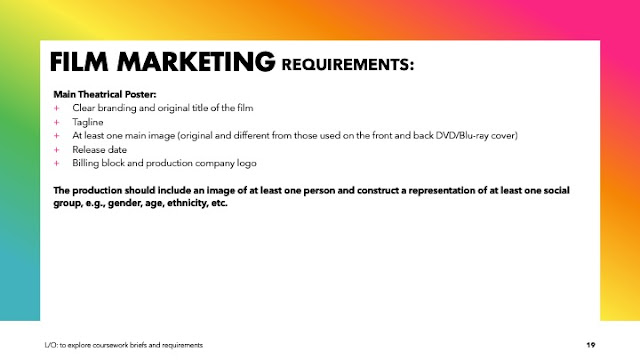
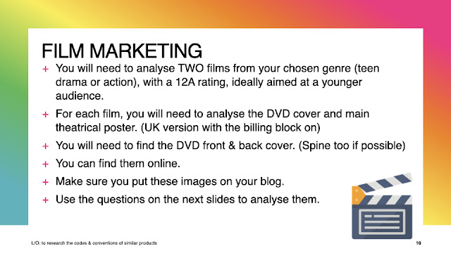
NEA Introduction
LO: To explore coursework briefs and requirements


Initial ideas:
- Boxing
- conflict
- bullying
- fighting
- poor
- Image of MC and best friend from a while back
- antagonist will be a thug threatening his family because of something MC did
- Tagline at t op something like: 'box, sleep, repeat'
8 image initial ideas:
- main image: picture of MC and AC with fists up facing each-other will a boxing bag in the middle
- DVD main image: MC sitting and sweating with boxing gloves on
- 4 images on the DVD: image of his MC and friend, image of thug base, garage and boxing bag, gym
- Back image on DVD 3 best friends (probably me Mikey and Jonah)
Title ideas:
- Broken revenge
Friday 13th June 2025
Do Now 4/5
- Not examined Assessment
- No
- Yes (only barcodes blogs ect)
- 30%
- Codes and conventions
NEA research
Research


 |
| DVD poster 1 |
Front
- The main character with what looks like a side character, we can see from this they are in a battle or definitely middle of action this can show the creator wanted you to wonder what was happening in it making you wanna watch it. It uses a Medium long shot with the background blurred this could show a hint of mystery and want us to find out what it is
- The title is at the very top of the screen and uses a sans serif font its very bold and t he typography can show us it a very technological advanced show with the grey hint and metalic material
- The tagline 'LIVE, DIE, REPEAT' has connotations of a cycle of life and the fact its in full uppercase and with a yellow colour that contrasted with the rest of the writing which is grey shows its very important piece of text. It could also show that this movie is quite graphic
- The colour pallet that is used consists of: dark blue, grey, yellow, orange. These kinds of colours tell us this film could be Sci-Fi
- Additionally the two main characters actor names are place on top of the title in a sans serif font
- The fonts of all the texts are the same: sans serif
- The genre is sci fi/action
Back
- There is no main image on the back of this poster
- There are 5 thumbnails shown each showing aspects of action and Sci-Fi they really make you curious on what happens in this move with the creature in one ships in others
- The images could show its a man vs creature show with the main two people plus others fighting those creatures
- there are many enigmas of what are the creatures and what doe the tagline mean same with all the characters and futuristic tech in the thumbnails
- the blurbs are talking about defeating aliens which relates to the Sci-Fi/Action genre of the film
- The colour pallet is mainly a dark army blue with hints of white and green these relate to the genre as the show is about the government killing these aliens
- Additionally other info like characters the rating production company producers etc are placed near the bottom
- There looks to be a women soldier in one of the images which challenges stereotypes of women not being able to fight
 |
| DVD Poster 2 Front
Back
|

- the main image is of the two main characters and uses a long shot. They are presented as being very strong and power full characters nut also seem worried
- title and info at the bottom
- warner bros logo is in the bottom corner very tiny
- the title is near the bottom and is in sans serif front in all caps and it stands out a lot
- additionally the tagline is also shown and its bigger than the title
- it uses a very industrial colour pallet with lots of greys yellows and blacks
- there is only one font that is used and its mainly sans serif to represent the industrial look of the poster
- The main image is of the two main characters plus and phew side characters it uses a mid shot that highlights there facial expressions
- it is laid out so the characters are around the logo and tagline
- there are no other logos
- additionally under the title there is a tagline "When you can live forever, what do you live for" this highlights mystery to the cover as it makes the reader question what is on about
- it uses a very dark and depressing color palette with lots of greys blues and blacks and hints of skin color
- only one font is used and it is in serif with additional strokes on it connoting to the horror theme


No comments:
Post a Comment